Build a Darkmode Switch

Let’s learn how to build a darkmode switch using localstorage, React and React Hooks.
If you missed my last article, please be sure to check out How to Build a React Hooks Slide In Modal.
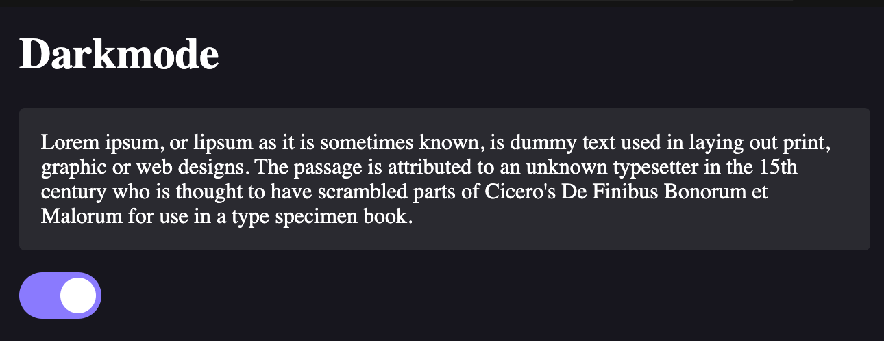
What we’re building
Setting up
Navigate to codesandbox.io and create a React sandbox. From the left side panel, click on ‘Add dependency’ and then add ‘styled-components’.
At the top of the app.js, import styled and useState, as follows:
import React, { useState } from 'react';
import styled, { css } from 'styled-components';
We will utilze the useState React Hook, as well as styled and the css helper from styled-components.
Create your components
Next, let’s create our components:
const Card = styled.div`
  background-color: var(--color-grey-1);
  border-radius: var(--global-radius);
  margin-bottom: 16px;
  padding: 16px;
  transition: background-color 0.3s ease-in-out;
`;

const AppWrapper = styled.div`
  padding: 16px;
`;
We can use these components as such:
<AppWrapper>
  <h1>Darkmode</h1>
  <Card>
    Lorem ipsum, or lipsum as it is sometimes known, is dummy text used in laying out print, graphic
    or web designs. The passage is attributed to an unknown typesetter in the 15th century who is
    thought to have scrambled parts of Cicero's De Finibus Bonorum et Malorum for use in a type
    specimen book.
  </Card>
</AppWrapper>
Add state
Next, we can pass a darkmode prop to the <AppWrapper /> component, which we will use to toggle darkmode on and off.
To do this, first we need to add state using React Hooks. For now, we can set the default value to false:
const [darkmode, setDarkmode] = useState(false);Then in our component we can pass the darkmode prop here:
<AppWrapper darkmode={darkmode}>To make this work, we’ll also need to add some conditional styles. Update your <AppWrapper /> component like this:
const AppWrapper = styled.div`
  padding: 16px;
  transition: background-color 0.3s ease-in-out;

  ${({ darkmode }) =>
    darkmode
      ? css`
          background-color: var(--color-darkmode-layer-1);
          color: var(--color-white);

          ${Card} {
            background-color: var(--color-darkmode-layer-2);
          }
        `
      : ''}
`;
Basically we are saying that when darkmode is set to true, we will apply the styles that are in between the css block.
styled-components also allows us to refer to components directly by adding ${ComponentName}. This way, when darkmode is on, the background of the <Card /> component will also be updated.
CSS variables
On a sidenote, you probably noticed that we are using var(--some-variable-name) in our code. What is up with that?
This is a draft feature in the newest version of CSS which is supported by most major browsers except Internet Explorer. In order to use these variables, you need to define them in the styles.css file like this:
:root {
  /* Colors */
  --color-primary: #8a7afe;
  --color-white: #fff;
  --color-grey-1: #ceced0;

  /* Darkmode */
  --color-darkmode-layer-1: #282829;
  --color-darkmode-layer-2: #666568;

  /* Globals */
  --global-radius: 4px;
}
Then you can use them wherever you want using the var(--some-variable-name).
Check out the MDN web docs about CSS variables for more info about how this works.
Adding the toggle switch
Instead of spending time creating our own css toggle switch, let’s use one that is already built. Check out w3schools on how to build a css switch. All you need to do is copy and paste the css into your styles.css file, and add the following markup:
<label className="switch">
  <input type="checkbox" />
  <span className="slider round" />
</label>
We will add the onChange function and checked logic in the final step.
Add local storage and toggle function
Last, we will add our change handler and make use of localstorage to save the value of this setting. Like so:
<label className="switch">
  <input
    type="checkbox"
    onChange={handleToggleDarkmode}
    checked={darkmode}
  />
  <span className="slider round" />
</label>
The handleToggleDarkmode function will look like this:
const handleToggleDarkmode = () => {
  const newDarkmodeValue = !darkmode;

  setDarkmode(newDarkmodeValue);
  setLSItem('darkmode', newDarkmodeValue);
};
Remember, setDarkmode is the update handler we defined in our useState statement:
const [darkmode, setDarkmode] = useState(false);setLSItem is actually a simple helper method that is using the window.localstorage.setItem() method. I also created a fetchLSItem helper:
const fetchLSItem = (itemName) => window.localStorage.getItem(itemName);
const setLSItem = (itemName, value) => window.localStorage.setItem(itemName, value);
Note: normally we would want to check if
windowandlocalstorageare defined before calling these methods, but for simplicity, we are ignoring that here.
Using these two methods, we can get the value of the saved localstorage item, and also update it by name.
For more information about this, check out the MDN web docs on Window.localstorage.
Fixing initial state
In order to ensure the user’s setting is saved on page refresh, we need to update our logic a little:
const initDarkmodeSetting = fetchLSItem('darkmode') === 'true';
const [darkmode, setDarkmode] = useState(initDarkmodeSetting);
This will use the fetchLSItem helper method to get the stored value of darkmode. If it is set to ‘true’, then darkmode was enabled by the user. Otherwise, it is either unset, or the user turned off darkmode.
Please note that localstorage saves values as strings, so even though we are storing true and false for the darkmode value, it is actually being converted to a string when it is stored.
By using const initDarkmodeSetting = fetchLSItem('darkmode') === 'true';, we are able to convert this back to a boolean value.
Conclusion
And there you have it! A simple implementation of a darkmode switch that utilizes localstorage to save a user’s preference.
As you can see, it is quite simple to implement this popular user feature. Please check the sections below for additional resources, links and access to the source code for this project.
Additional Resources
If you are ever having trouble setting or fetching a localstorage item, you can use Chrome developer tools to inspect your application local storage.
To do so, open the developer tools and click on Application. And then click on the appropriate tab under Local storage.
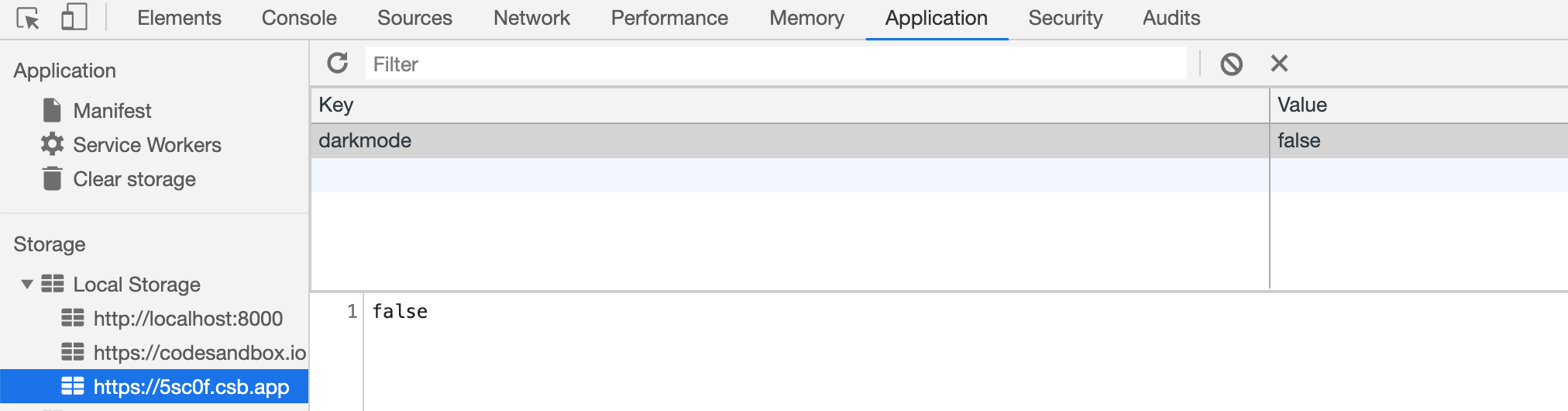
From here you can clear your storage, or manually update and delete individual keys.
Links
- CSS variables (Candidate feature) - MDN web docs
- w3schools - How to build a css switch
- Window.localstorage - MDN web docs
Source code
Use the following codesandbox to compare your code to mine.

As always, stay tuned for more updates and future posts!
Yamagata Developers Society
Are you interested in learning programming or connecting with engineers in Yamagata or Japan?
Come join us at Yamagata Developers Society. We have monthly meetups where you can learn about the latest technologies while making new friends.
Please check our About page for more information.